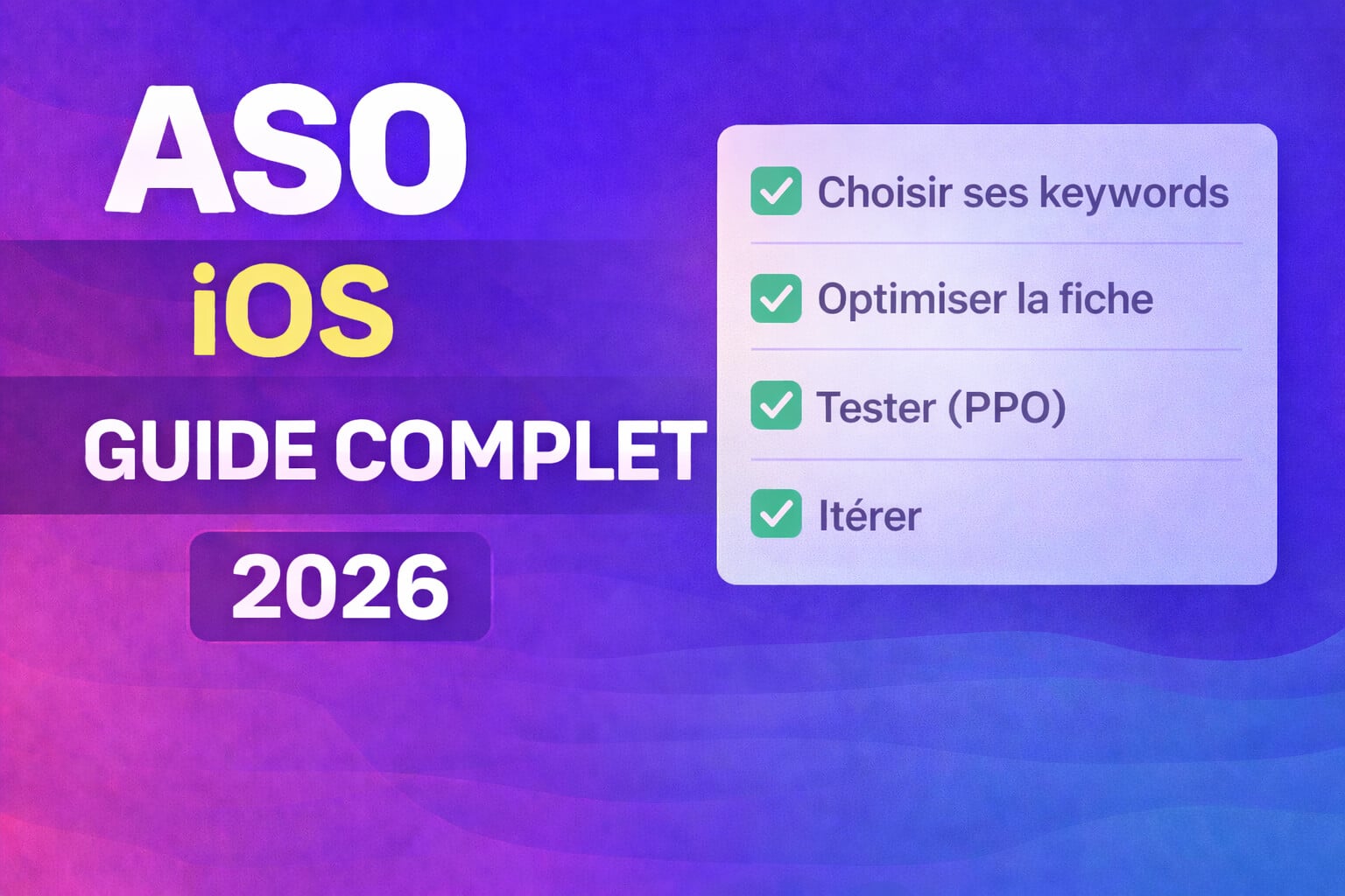
ASO: the complete guide to boost your installs (App Store)
Sommaire
- 1) Understand ASO (and what the App Store "actually looks at")
- 2) Positioning
- 3) Quick audit: where you're losing installs today
- 4) iOS metadata
- 5) Creatives that convert: icon, screenshots, preview video
- 6) Ratings & reviews: the trust multiplier
- 7) Category & browse: be compared to the right neighbors
- 8) Custom Product Pages & Product Page Optimization: test fast, learn fast
- 9) Localization: multiply opportunities without rebuilding everything
- 10) Measurement & iteration loop: ASO = a system, not a checklist
- 11) "7-day" action plan
- 12) Templates & checklists
- 13) Tools: the ASO stack
- 14) Useful links
Publishing an iOS app is a bit like launching a product in the middle of a gigantic trade show. Your app can be excellent, but if your App Store listing is blurry (or bland), you condemn yourself to relying on paid acquisition... or chance.
In this guide, we'll build an ASO strategy that is simple, measurable and iterative. And we'll do it with an angle I love: AI + solo dev (or small team), because yes, you can do serious ASO without a 12-person growth team.
Objective : increase your visibility (search + browse) and your conversion rate (tap → install), with a method you can execute continuously.
1) Understand ASO (and what the App Store "actually looks at")
ASO is the set of optimizations that improve:
- your discovery (being found)
- your conversion (being installed)
- your perceived quality (being chosen over a competitor)
The funnel to keep in mind
The App Store is a very short funnel:
- Impression (you appear)
- Tap (someone opens your product page)
- Install (someone downloads you)
- Activation (they understand the value)
- Retention (they stick around)
ASO mainly acts on Impression → Tap → Install. But beware: if your product is disappointing, your ratings, your retention and your download speed will eventually catch up with you.
Search vs Browse
- Search: the user types a keyword. Your job: appear and be chosen.
- Browse: the user explores categories, collections, "You might also like" pages. Your job: inspire confidence and be "clickable".
2) Positioning
The classic trap: trying to speak to everyone.
Good positioning does the opposite: it excludes a bit to become obvious to the right people.
What the user really wants
Example: when someone searches "AI", they are not looking for AI. They are looking for:
- a faster result (time saved)
- a better result (quality)
- a result inaccessible otherwise (breakthrough)
Concrete examples to display on your product page:
- "Generate X in 10 seconds"
- "Automatically transform Y into Z"
- "Summarize / correct / suggest / classify"
Mini positionning framework (1 sentence)
"For [persona] who wants [job], my app delivers [measurable result] thanks to [differentiator]."
Example for TaleMe:
"For busy parents who want personalized stories, the app generates a story in 20 seconds thanks to a guided AI."
3) Quick audit: where you're losing installs today
Before optimizing, identify the bottleneck.
The 3 classic symptoms
- Low impressions → keyword / category / traction problem
- Low tap rate → icon, name, subtitle, rating problem
- Low install rate → screenshots, proof, trust problem
Metrics to look at (minimum viable)
- Impressions (Search + Browse)
- Product Page Views (or equivalent)
- Conversion rate (view → install)
- Average rating + review volume
4) iOS metadata
On iOS, the "text" fields do a large part of the job for Search.
4.1 App name: short, memorable, useful
The name is not just branding. It's also your first relevance signal.
Best practices :
- 1 to 4 words max
- readable and pronounceable
- avoid generic names that are impossible to search
Example :
- Bad: "AI Studio Pro Max"
- Better: "StoryCraft – AI Stories"
4.2 Subtitle: the one-line promise
The subtitle is used to clarify:
- who it's for
- what it provides
Effective patterns :
- Benefit: "Create visuals in 10 s"
- Use case: "Voice notes → summaries"
- Differentiator: "AI offline, no account"
4.3 Keywords field
On iOS, the Keywords field is invisible to the user, but it counts for Search discovery. Apple limits this field to 100 characters, with terms separated by commas (spaces are useless) — but you can use spaces inside a phrase if you really need them (e.g.: real estate).
The idea is not to stuff the field, but to maximize intent coverage.
4.3.1 What you need to understand
- Name and subtitle are priority: put your most important keywords there first.
- The Keywords field serves as a word bank: you mainly put secondary words, synonyms, intent variants, and words you can't fit neatly into branding.
- The goal isn't "be #1 for X". The goal is to be found on useful and converting queries.
4.3.2 The golden rule: intention > volume
A high-volume keyword that doesn't convert is just… unproductive traffic.
In practice, look for keywords that describe:
- the job (what the user wants to do)
- the object (what they act on)
- the result (what they get)
Examples (for an app using AI) :
- job : "summarize", "correct", "generate", "retouch", "translate"
- object : "notes", "meeting", "photo", "text", "PDF", "homework"
- result : "fast", "pro", "no account", "offline", "in 10s"
4.3.3 Method to build your list (in 30–45 min)
Step A — Raw list (30 words)
Take 10 minutes and write 30 terms without filtering:
- 10 "jobs" (verbs)
- 10 "objects" (nouns)
- 10 "results / benefits"
Step B — Autocomplete + user lexicon
- Type your 10 main words in the App Store search.
- Note the suggestions.
Step C — Competitors (5 product pages)
Open 5 competing apps and collect:
- the pattern of their name
- the subtitle
- the words repeated in their screenshots (clue about intent)
Step D — Estimate demand
Even if you don't run Apple Ads, the Apple Ads interface gives an idea of the relative popularity of queries (useful to avoid dead keywords).
Tip: don't look for "the perfect score". Aim to avoid blind decisions.
4.3.4 Prioritize
Make a mini-matrix for your 30 words:
- Relevance (0–3): does it really describe your product?
- Conversion intent (0–3): is someone searching this likely "ready to install"?
- Perceived competition (0–3): is it dominated by 3 giants impossible to dislodge?
Keep 10–15 words that score well.
4.3.5 Fill the field without wasting characters
Anti-waste checklist :
- ✅ No duplication with name / subtitle
- ✅ No internal duplication (don't repeat the same word twice)
- ✅ Avoid stop words ("de", "pour", "the", "app", "best")
- ✅ Prefer short words (they "open" more combinations)
- ✅ Use commas as separators (not semicolons)
- ✅ Don't add marketing "fillers" (they're useless here)
When to use a phrase ("2 words or more")?
- When the phrase is a natural "block":
real estate,to do,voice notes. - When separating the words creates absurd expressions.
Most of the time separated words are sufficient.
4.3.6 Examples: what a clean field looks like
Case 1 — AI meeting / summary app
- Name :
Minutes – AI Notes - Subtitle :
Meetings, ideas, actions - Keywords :
transcription,summary,minutes,audio,dictation,tasks,productivity
Case 2 — AI photo retouch (portrait)
- Name :
PortraitLab – AI Pro Photos - Subtitle :
Face, background, lighting - Keywords :
retouch,portrait,face,background,pro photo,avatar,resume,linkedin,filter
4.3.7 Bonus: cross-localization = more "surface"
On the App Store, some stores index two localizations (primary language + secondary language). Known example: in the United States, indexing can consider English (US) and Spanish (MX).
In the era of artificial intelligence where it's easy to translate effectively into multiple languages, don't ignore this lever.
- add a secondary localization without breaking UX
- use it to complement your keywords
- keep visible fields (name/subtitle) coherent
Use with caution: an indexing gain is not worth an incomprehensible listing.
4.4 Promotional text : your mini "no-update" banner
This field is perfect to:
- announce a new feature
- explain a differentiator
- reassure ("no account", "private data")
Example :
"New: 2× faster generation + 'manga' style models. Free trial, easy cancel."
4.5 Description
On iOS, the description mainly serves to:
- reassure, convince
- detail use cases
- answer objections
Recommended structure :
- 1 hook (benefit)
- 3 to 5 bullet points (proofs / features)
- 1 "Who is it for?" section
- 1 mini FAQ (pricing, privacy, offline)
5) Creatives that convert: icon, screenshots, preview video
If your ASO were a landing page, the icon + the first 3 screenshots would be your hero section.
5.1 Icon: 1 second to be "understood"
A performing icon is often:
- simple
- high-contrast
- recognizable at small size
Common mistakes :
- too many details
- unreadable text
- abstract symbol without meaning
Example :
- a pictogram that evokes the action ("magic wand", "spark", "scan", "mic") rather than a "corporate logo".
5.2 Screenshots: tell a story, not an interface
The goal is not to show your app.
The goal is to show what the user gets.
Simple storyboard (8 slides) :
- Hook: "Generate X in 10 seconds"
- Problem: "No more need to…"
- Solution: "You do this → you get that"
- Proof: "examples / before-after"
- Feature #1 (benefit)
- Feature #2 (benefit)
- Trust: "private data / offline / fast support"
- Soft CTA: "Try for free"
5.3 App preview video
A video helps when:
- the product is very visual
- the value is hard to understand in 2 images
It hurts when:
- you make a generic marketing trailer
- you hide the real UI
6) Ratings & reviews: the trust multiplier
On iOS, reviews are a mental shortcut:
- "many reviews + good rating" = safe
- "few reviews + average rating" = risk
6.1 The right moment to ask for a review
Don't ask for a review at launch.
Ask after a moment of success:
- export finished
- document generated
- goal achieved
- first week of successful use
6.2 Clean review prompt pattern
- 1 internal screen: "Is it going well?"
- if yes → ask App Store review
- if no → private feedback (email / form)
6.3 Responding to reviews
Responding to reviews is:
- support
- marketing
- a maintenance signal
And above all, it's a goldmine for your next screenshots and your copy.
I wrote an article about collecting reviews here
7) Category & browse: be compared to the right neighbors
The category is your aisle in the supermarket.
If you pick the wrong one, you end up compared to giants… or to apps that don't do the same job.
Mini-framework (3 questions)
- Where do users expect to find this product?
- Who is the "natural competitor" in that aisle?
- Am I credible against them on the promise?
8) Custom Product Pages & Product Page Optimization: test fast, learn fast
The speed of iteration is key.
Apple gives you two very concrete tools:
- Product Page Optimization (PPO): A/B test for icon, screenshots, preview.
- Custom Product Pages (CPP): multiple pages for different audiences (up to many).
8.1 PPO: your conversion lab
Principle: you test a variation, you compare it to control.
Good tests :
- a different hook on screenshot #1
- a different visual style (sober vs punchy)
- a different angle (AI "time saving" vs AI "quality")
8.2 CPP: a page per intention
The best use of CPP: align your page with intention.
Examples :
- "AI for students" vs "AI for pros"
- "Image generator" vs "Portrait retouch"
- "Voice notes" vs "Meetings"
And then you use these URLs in:
- your campaigns
- your posts
- your backlinks
9) Localization: multiply opportunities without rebuilding everything
Localizing your metadata can unlock entire markets.
- start with 1–2 high-potential languages
- localize first: name/subtitle/keywords
- adapt screenshots only if traction follows
AI tip: use AI to propose variants, but validate vocabulary with real users (or at least local competitors).
10) Measurement & iteration loop: ASO = a system, not a checklist
The right rhythm is:
- 1 hypothesis
- 1 change
- 1 measurement
And you repeat.
Example of a simple loop
- Hypothesis: "The hook 'Generates in 10 seconds' will increase install rate."
- Action: new screenshot #1 (PPO)
- Measurement: conversion vs control
- Decision: keep / iterate / abandon
11) "7-day" action plan
Day 1 — Audit + benchmark
- capture your current metrics
- take a screenshot of 5 competitor product pages
- note what is understood in 3 seconds
Day 2 — Positioning + copy
- 1 positioning sentence
- 3 possible hooks (time saving / quality / novelty)
Day 3 — Screenshots storyboard
- write your 8 slides like a script
- mock up quickly (Figma, Canva, even Keynote)
Day 4 — Icon (iteration 1)
- 2 variants max
- prepare a PPO test if possible
Day 5 — Reviews (review gate)
- implement a "moment of success"
- channel negative feedback privately
Day 6 — Keywords + subtitle (and a mini cross-local strategy)
- write 30 words (jobs / objects / results)
- keep 10–15 words that match your conversion intent
- put the most important in name / subtitle (visible)
- put the rest in Keywords (bank, zero duplication)
- if relevant: add a secondary localization to complete indexing (without degrading UX)
Day 7 — Launch tests
- 1 PPO running
- 1 CPP for a clear intention
- 1 weekly follow-up in your doc
12) Templates & checklists
Template: subtitle
- "[Verb] [object] in [time]"
- "[Use case] for [persona]"
- "[Result] without [friction]"
Template: screenshot #1 (hook)
- "[Strong benefit] in [X seconds]"
- "[Before] → [After] (visual)"
- "The [job] made simplest (really)"
Checklist "Tap" (listing)
- Legible icon at small size
- Memorable name
- Clear subtitle
- Reassuring rating (or strategy to improve it)
Checklist "Install" (page)
- Screenshot #1 = benefit
- Coherent storyboard
- Proofs (before/after, examples)
- Objections addressed (price, privacy, account)
Checklist "Learn"
- 1 hypothesis at a time
- measurable test
- documented decision
13) Tools: the ASO stack
ASO can quickly become complicated and the temptation to use a myriad of tools is strong... while a minimal setup is already enough to make progress.
My personal rule:
- Start with Apple's native tools (free) → you measure and you test.
- Add a keywords tool (if you want to speed up) → you stop deciding blindly.
- Add a reviews / insights tool when you have volume → you industrialize without losing field contact.
13.1 The "free" starter pack (Apple)
- App Store Connect: it's your source of truth (impressions, page views, conversion, etc.).
- Product Page Optimization (PPO): native A/B tests on icon, screenshots, videos.
- Custom Product Pages (CPP): multiple product pages for multiple intentions (and one URL per page).
- Apple Search Ads: even if you don't run ads, it's handy to sense the relative popularity of certain terms.
If you only use this, you can already do 80% of the work: measure → test → iterate.
13.2 Astro — tryastro.app
If you want a simple tool, Astro is a great option.
What I like about this type of tool is that it saves you time on:
- position tracking (follow your keywords over time)
- popularity / difficulty (to avoid impossible words)
- keyword ideas (and trends by country / genre)
- localizations (which languages "open" multiple countries)
The point is simple: you can make more rational decisions in a few minutes, instead of tinkering by feel.
13.3 More "complete" alternatives
If your app begins to grow (or if you work in a team), here are platforms often used to go further:
- AppTweak: very ASO-oriented (keywords, tracking, competitive analysis).
- App Radar: ASO suite + tracking + (depending on plans) review management.
- MobileAction: fairly complete (ASO + insights), often used on the acquisition side.
- Sensor Tower: well known for market / keywords / competition.
- Appfigures: good mix ASO + market intelligence + Apple focus (Apple Ads, etc.).
- data.ai: more "app intelligence / market", useful for macro views.
Tip: don't look for "the best tool". Look for the best tool for your level (and your budget).
13.4 Reviews & reputation: tools to avoid drowning
When you start getting reviews, you want two things:
- quickly spot recurring issues (crash, paywall, perf, UX)
- respond properly, without spending your life on it
Tools often used:
- AppFollow: monitoring + responses + reporting + side ASO.
- Appbot: review analysis (themes, sentiment, recurring keywords), useful to turn reviews into roadmap.
13.5 Visuals & screenshots (huge time saver)
Most apps underperform simply because their screenshots are… raw screenshots.
You can gain a lot (without being a designer) with tools that industrialize production:
- Rotato: quickly generates App Store packs (multiple sizes) with neat mockups. rotato.app
- Previewed: templates + screenshot generator, good for iterating quickly on a style. previewed.app
- appscreen (open-source): if you want a free and scriptable tool to generate your screenshots. github.com/YUZU-Hub/appscreen
The important point: it's not the tool that makes conversion, it's your storyboard (the message on your first 3 slides).
14) Useful links
Apple Docs (ASO / App Store Connect)
- Product Page Optimization : https://developer.apple.com/app-store/product-page-optimization/
- Custom Product Pages : https://developer.apple.com/app-store/custom-product-pages/
- Creating your product page : https://developer.apple.com/app-store/product-page/
- App Store search (keywords) : https://developer.apple.com/app-store/search/
- App Store Connect — App information (limits name/subtitle) : https://developer.apple.com/help/app-store-connect/reference/app-information/app-information/
- App Store Connect — Promo text / description limits : https://developer.apple.com/help/app-store-connect/reference/app-information/platform-version-information/
- Screenshot specifications : https://developer.apple.com/help/app-store-connect/reference/app-information/screenshot-specifications/
- Requesting reviews (StoreKit) : https://developer.apple.com/documentation/storekit/requesting-app-store-reviews
- App Review Guidelines : https://developer.apple.com/app-store/review/guidelines/
Comments
Loading...